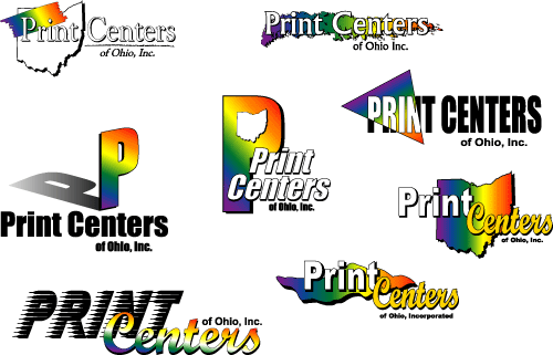
Second Proof:
Additional instructions included: "keep the spectrum idea, emphasize 'Print Centers' more than 'of Ohio, Inc.' and keep up the good work." The following ideas were submitted:

Still not knowing what fonts they would want to use, we narrowed down the choices as best as possible. This proof has the beginning idea of the final logo (the upper right one with the prismatic triangle). Once submitted they discarded the ones they didn't like and then asked us for various concepts on the few that they did like: